
overview
This was the first project where we reinvented landing page of a program in Moodle ( Learning Management System). Part of the strategy was to incorporate Personas representing a diverse ethnicity, gender and age to be inclusive of all. We were limited to four people. And did a photoshoot with those who were available. As part of the interaction design, when hovering over each persona, the character would animate to create pleasure and illustrate creativity.
Sometimes a designer’s design decisions are overruled and choice of color was one of those decisions. Although the magenta and blue trend colors (at the time of design) are bright, bold and pop for attention, they do not align with the corporate brand colors. The program designed to welcomes New Manager into the VCH culture now lacks the corporate colors. On the plus side it is enhanced with Corporate typography. Below are the proposed color decisions advocating a fund diverse energetic composition within the VCH brand colors.

The module is designed in Articulate Storyline.
Here is a quick demo of the interaction of New Manager Orientation Program. Transitions created a very smooth flow in interaction.
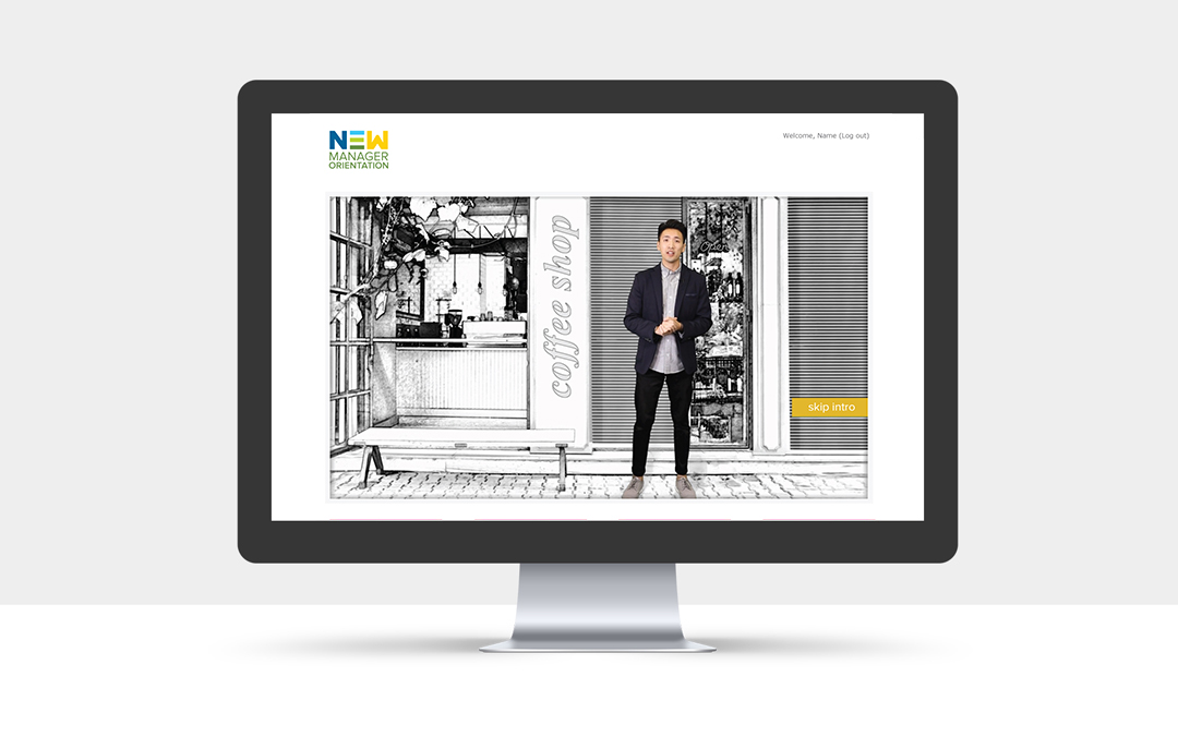
interview video
The curriculum structured by the ID and SMEs is four modules with one interview video for each module. In collaboration with colleague designer, ID and SMEs we proposed selection of personas strategically across coastal to get racial and geographic, and gender diversity.
Crew: 2 people on Camera and one person asking interview questions
Camera: 2DSLRs
Post production: Premier, After Effects, Photoshop, Audition
Date: Nov 2016
site architecture


